Improving User Experience + Interface
Reimagining the Craigslist mobile app with a more intuitive user experience, improved navigation, and enhanced communication tools.
Overview
Craigslist is a widely used platform for buying, selling, and listing services, but its outdated design and lack of modern features create real usability challenges. This project reimagines the Craigslist mobile app with a more intuitive user experience, improved navigation, and enhanced communication tools.
The Existing App
Before designing anything, I spent time with the existing Craigslist app to understand its structure and where friction occurs. The dark, text-heavy interface makes it hard to scan, and the category system requires too many steps to find what you're looking for.
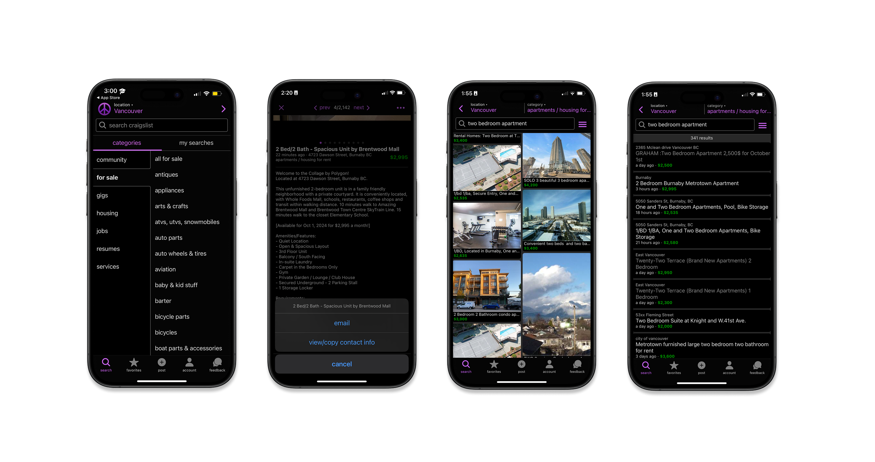
Existing Craigslist app — cluttered navigation, text-heavy listings, no in-app messaging
Problems I Identified
Competitive Analysis
To understand Craigslist's strengths and weaknesses in context, I analyzed five competing platforms: Facebook Marketplace, OfferUp, eBay, Nextdoor, and Craigslist itself. The comparison focused on four key areas: Strategy (user needs & business objectives), Scope (content & functionalities), Skeleton (interface & navigation), and Surface (visual hierarchy & aesthetic appeal).
|
Craigslist
|
Facebook
|
Nextdoor
|
eBay
|
OfferUp
|
|
|---|---|---|---|---|---|
| User Trust | No ratings or reviews | Profile-based trust | Seller ratings | Seller ratings | Community-based trust |
| Navigation | Long category lists | Simple, social integrated | Mobile friendly | Overwhelming | Local focused |
| Messaging | No in-app messaging | Real-time chat | Secure messaging | eBay messaging | Limited communication |
| Visual Appeal | Basic and text heavy | Image driven | Clean UI | Structured product pages | Text heavy |
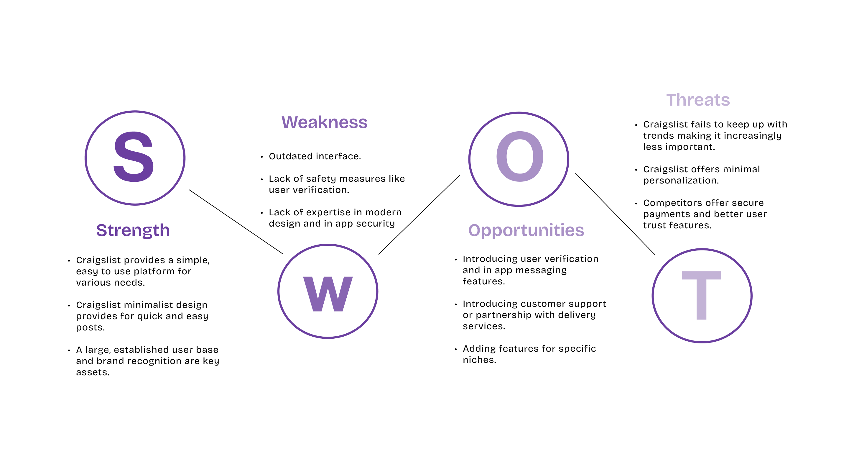
SWOT Analysis
The SWOT analysis revealed that while Craigslist has a massive, established user base and genuinely valued simplicity, the lack of safety measures, modern design, and in-app security leave significant room for improvement — and open the door for competitors.
User Interviews
To gain deeper insights into how users interact with Craigslist, I conducted four user interviews to explore their experiences, pain points, and expectations. These conversations revealed key challenges that directly shaped my design decisions.
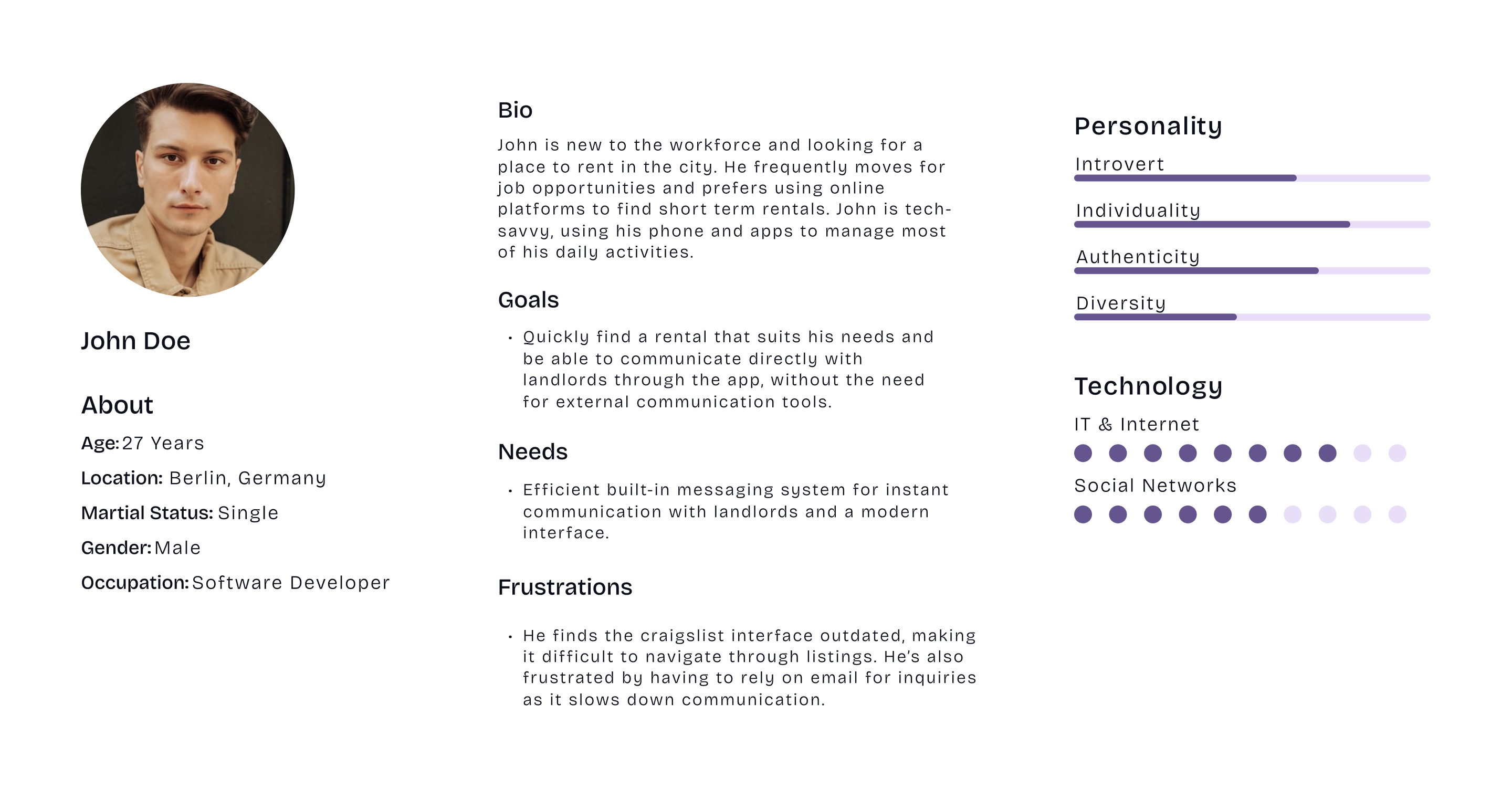
User Persona
From the interviews, a clear primary persona emerged: John, a 27-year-old software developer in Berlin who frequently moves for work and relies on his phone for daily tasks. He wants to find short-term rentals and communicate directly with landlords — without being routed to external email.
Design Challenge
How might we redesign Craigslist's mobile app to be trustworthy, navigable, and modern — while preserving the simplicity that keeps millions of users coming back?
My Solutions
Site Map
Before jumping into wireframes, I mapped out the full information architecture of the redesigned app. The site map helped clarify how categories, search, and user account features would connect — and revealed where the original app forced users into unnecessary depth just to reach common actions.
Keeping the homepage as the central hub, with direct access to Categories, Search, Profile, Wishlist, and a persistent Menu, reduced the number of taps needed to complete core tasks and formed the backbone of the simplified navigation system.
Wireframes
With the site map as a guide, I moved into low-fidelity wireframes to test layout decisions before committing to visual design. Wireframing allowed me to quickly explore different approaches to the listing card structure, search flow, and messaging interface — focusing purely on hierarchy and interaction, not aesthetics.
Key decisions made at this stage included the placement of the bottom navigation bar, the visual weight of listing thumbnails, and how the in-app chat would be accessed from a listing detail page.
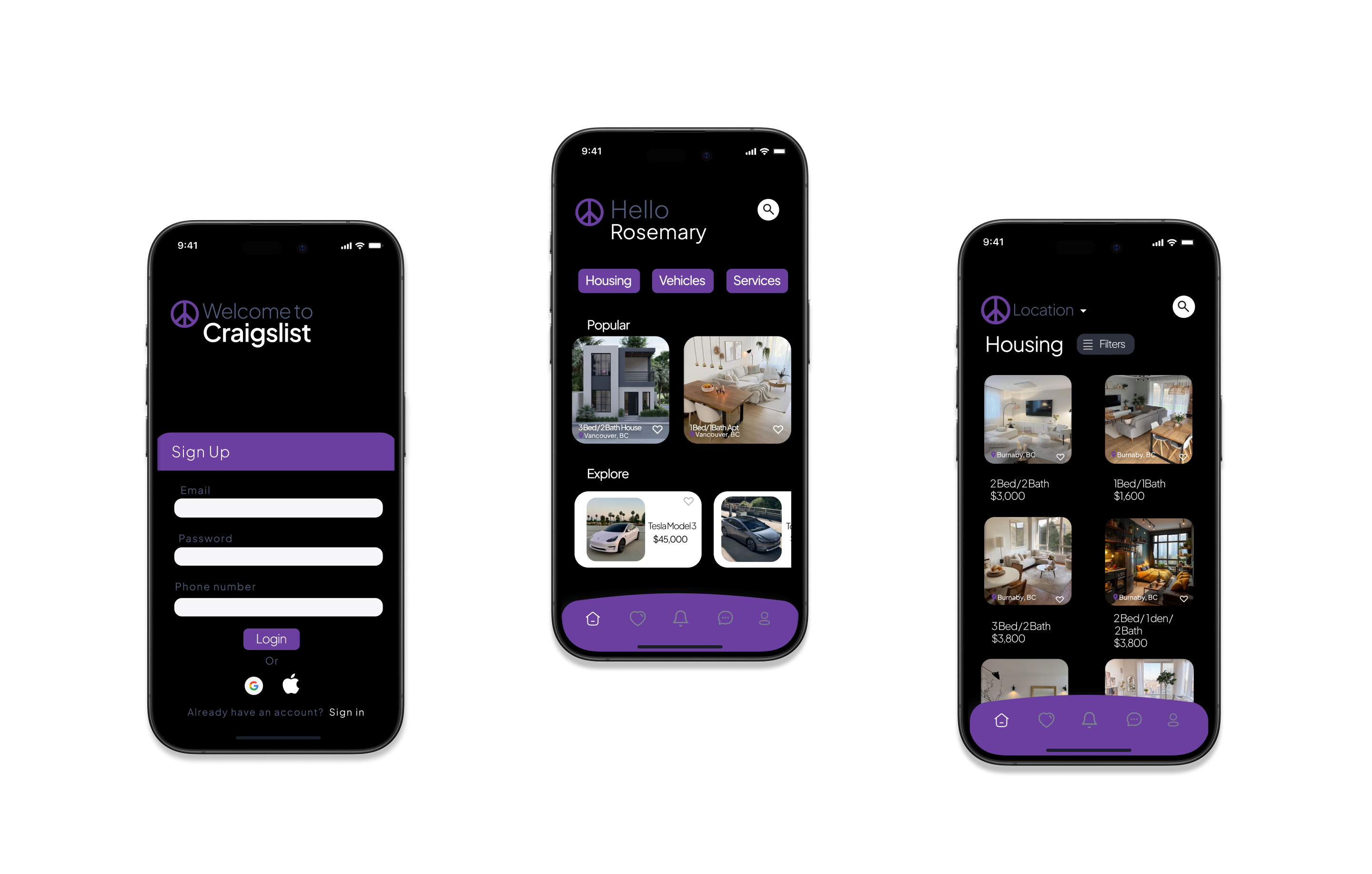
Final Design
The high-fidelity prototype brought together all three solutions into a cohesive mobile experience — cleaner navigation, image-forward listing cards with trust signals, and a fully integrated real-time messaging system.
High-fidelity prototype — final screens
Usability Testing
To assess the effectiveness of the redesign, I conducted usability testing with three participants. Each user was asked to complete two core tasks: find a house to rent using the redesigned navigation and search features, and contact the seller using the integrated messaging system.
| Task | Success Rate | User Feedback |
|---|---|---|
| Find a rental listing | 3/3 completed | "The old Craigslist was frustrating. This version is way easier to use!" |
| Contact the seller | 3/3 completed | "I love the built-in chat. Way better than emailing." |
| Overall experience | ★★★★½ | "I'd use this over the real Craigslist." |
Reflection
This project was an opportunity to reimagine Craigslist with a user-centered approach, addressing its outdated interface, inefficient communication, and trust issues. Through research, competitive analysis, user interviews, and usability testing, I gained valuable insights into how users interact with online marketplaces and what makes an experience truly seamless.
One challenge was balancing Craigslist's minimalistic nature with modern UI improvements — ensuring the design stayed simple but functional. Usability testing reinforced the importance of iteration, where small tweaks like enhanced filtering and seller response times made a big difference.