A pitch for a more ethical, educational experience
Duolingo is the world's most downloaded language learning app — but beneath the friendly green owl lies a set of dark patterns that guilt-trip users, exploit streaks, and treat learners as a product. This redesign proposes an experience built on encouragement over pressure.
Overview
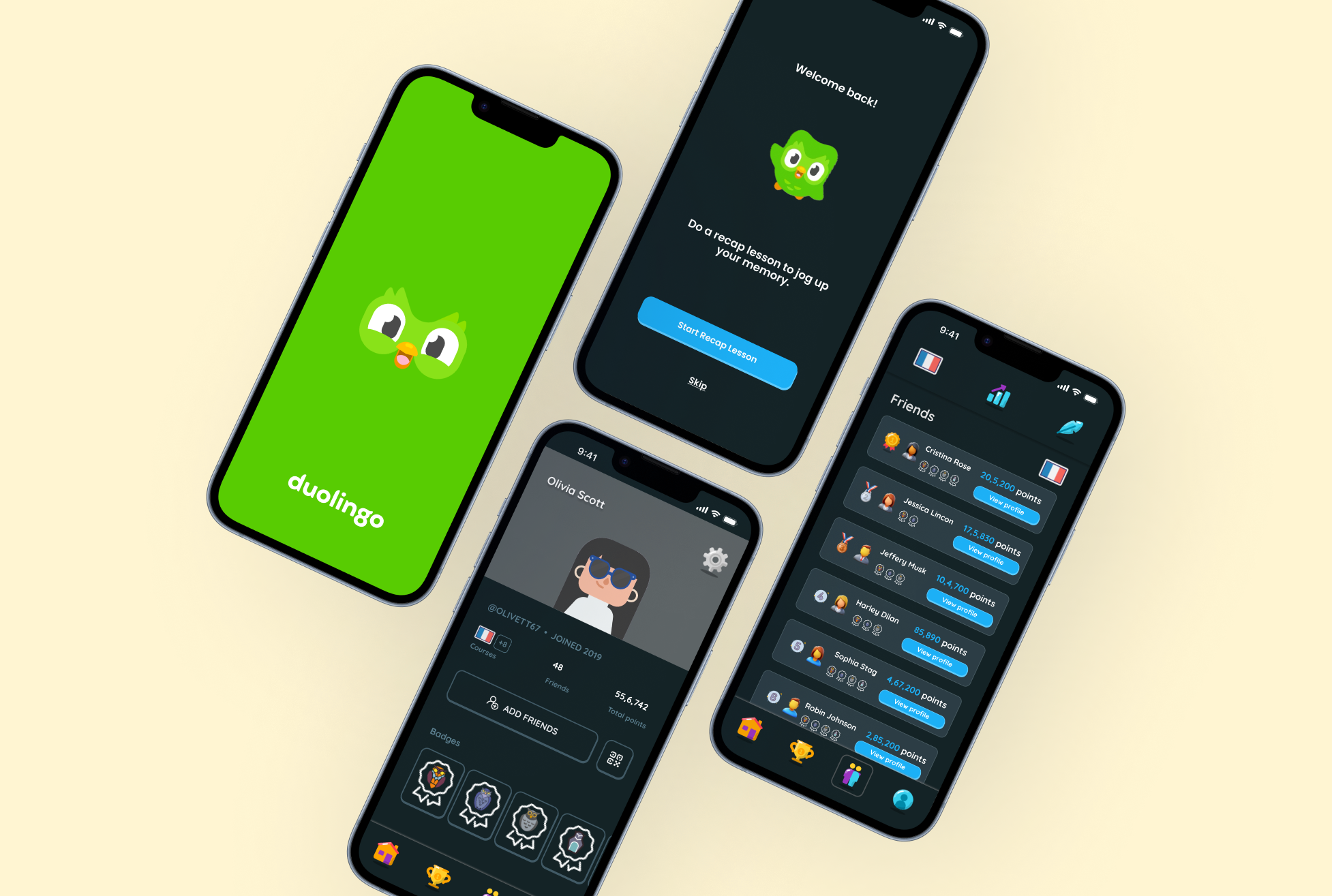
Duolingo offers short, interactive language lessons and uses gamification to motivate learners. With over 500 million users, it's the most downloaded education app in the world.
But the same mechanics that hook users also manipulate them. This project asked: what would Duolingo look like if it put genuine user wellbeing at the centre?
The Problems
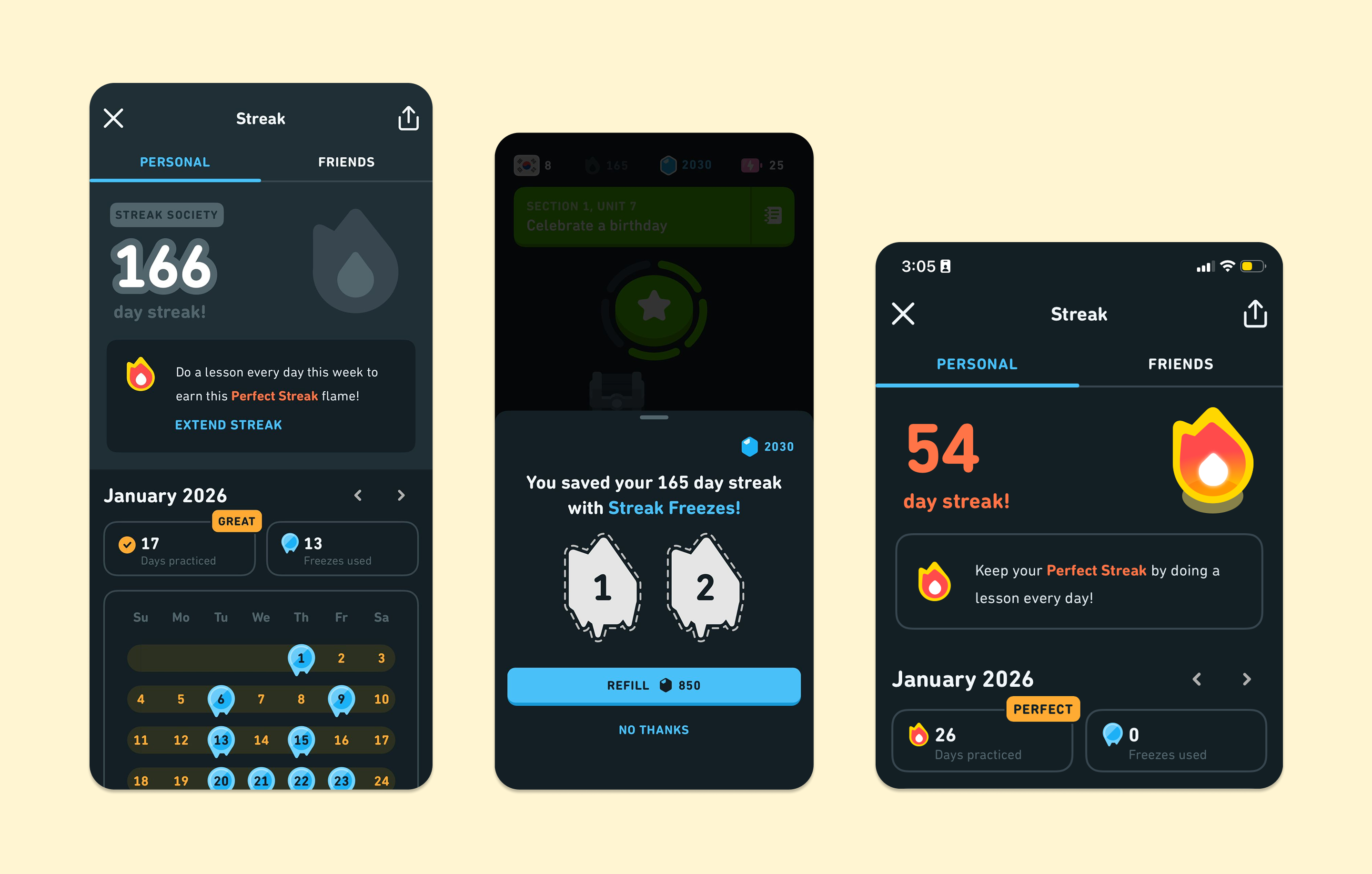
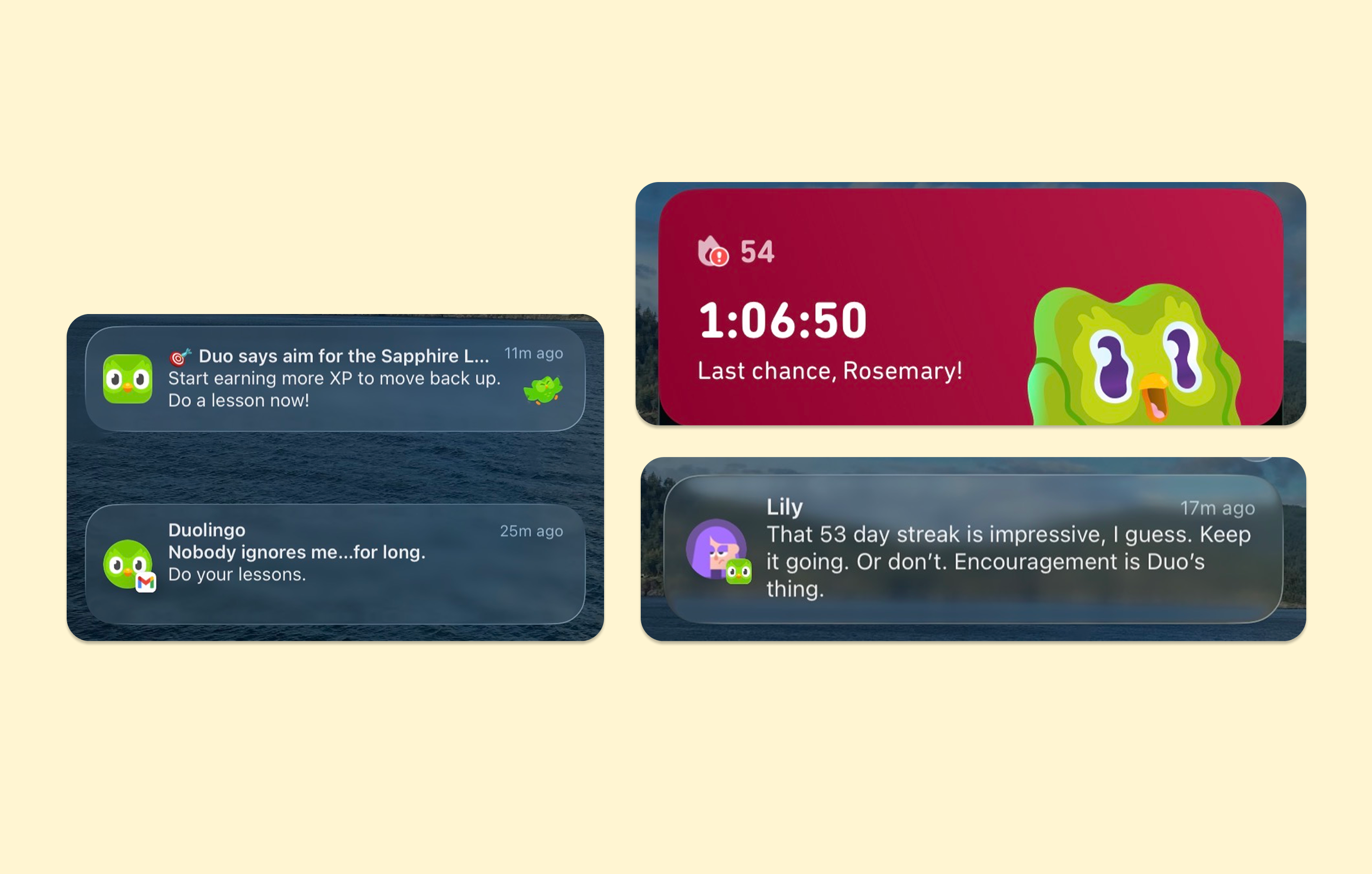
Through close analysis of the existing app, we identified design decisions that prioritize engagement metrics over genuine learning and often leave users feeling anxious, guilty, or manipulated.
Design Challenge
How might we redesign Duolingo so that users feel motivated, not manipulated — and actually learn a language along the way?
Storyboards
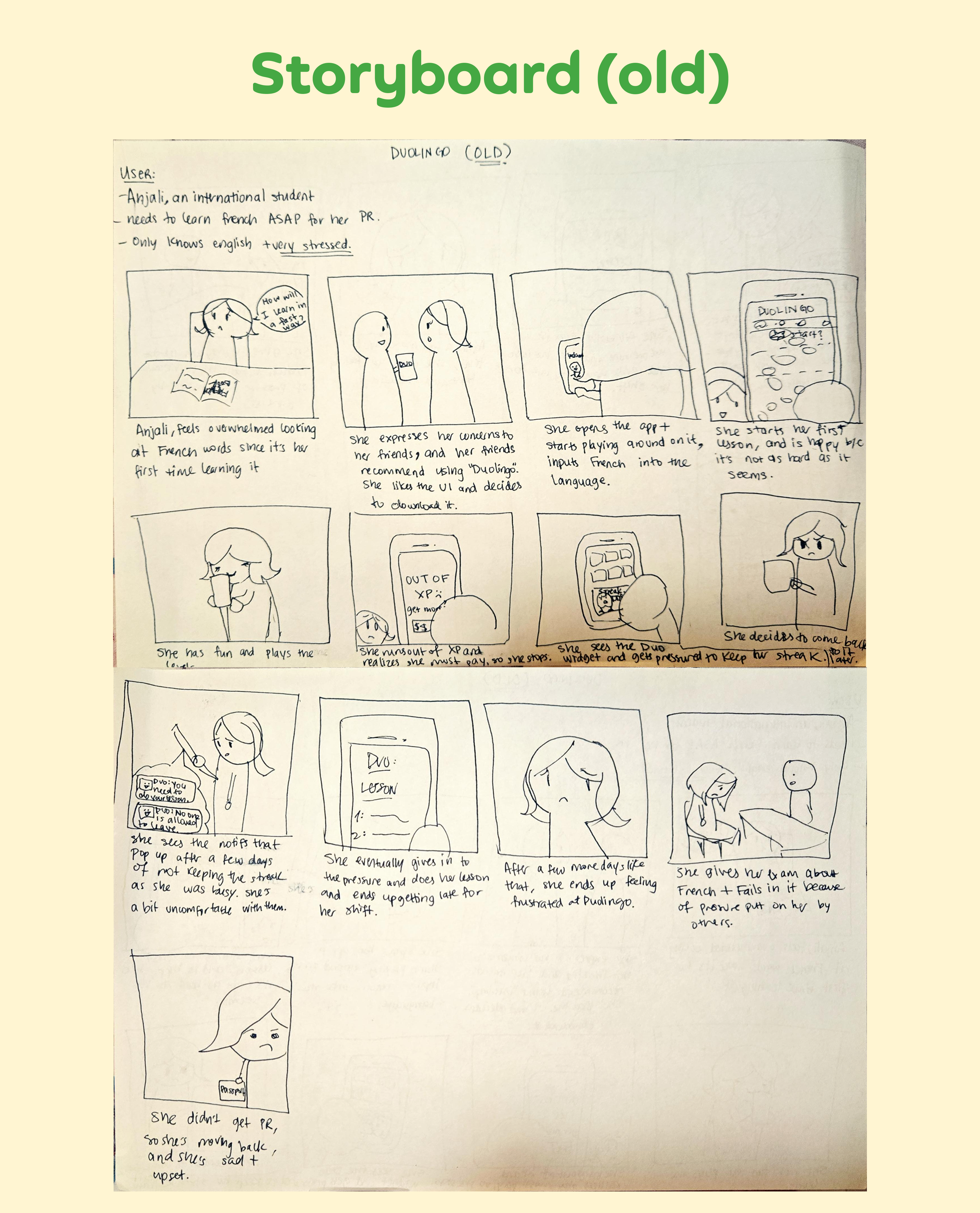
We created storyboards comparing the old and new experience through a shared user scenario. Anjali is an international student who needs to learn French for her Permanent Residency application, she's already anxious and under pressure.
In the old Duolingo, streak pressure and XP anxiety cause her to abandon the app and fail her exam. In the redesigned version, the app meets her where she is and supports her at her own pace, she passes.
Main Focus: Emotional Pressure
Rather than overhauling the entire app, we focused on the features causing the most emotional harm — and redesigned each one with care, flexibility, and user wellbeing in mind.
Style Guide
To maintain familiarity, we kept Duolingo's primary brand colours. In keeping with the redesign's more encouraging emotional register, the typeface combination of Feathers (bold headers) and Quicksand (body) maintains a warm and welcoming tone.
Final Design
The high-fidelity prototype brings all five solutions together. The visual language stays true to Duolingo's familiar character — same green owl, same playful energy, while removing the features that cause harm.
Reflection
This project aimed to question the principles embedded in a design system rather than just enhance a user interface. Duolingo's dark patterns are intentional product choices that put user engagement ahead of user welfare; they are not coincidental.
Working as a team let us stress-test our assumptions about what "motivating" design actually means. The biggest insight: users don't need more pressure, they need more trust, flexibility, and genuine encouragement.